
click through for one of my favorite blogs, MONSTER BRAINS

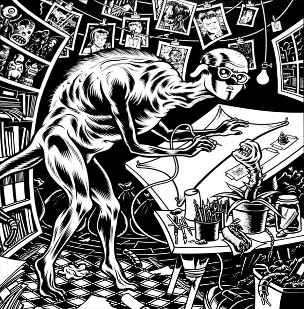
His plots play out like fever dreams, swirling through time and perception, but Charles Burns’ aesthetic style alone is enough to make you queasy. In a class on underground comix, I was assigned Burns’ most popular tome, Black Hole, as an introduction to contemporary comic art. During the second session on Burns, a few of my classmates begged the professor to let us move on. “I just can’t look at this stuff anymore,” one of them said. She was sitting close to the projector screen and a page from Black Hole from superimposed on her hair. I remember it being these panels:

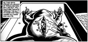
 My only qualm with Black Hole, though I do love it, is the sinister use of yonic imagery. Some useful information emerges from the vaginal openings Burns draws in his characters’ feet or throats, but mostly it’s just more nightmares. Flipping through Burns’ book, you begin to feel tension building around the image of what most characters call “the slit”. Oh great, another evil vagina, come to absorb you and your agency.
What I found most exciting in Black Hole were the repeated images of monstrous teenagers. They experience bodily changes which mirror “normal” stages of puberty (i.e. new patches of body hair, sensual urges toward others, changes in skin texture), becoming alienated from unchanged teens around them.
The kids in Black Hole are altered and mutated by a sexually transmitted infection (or something, it’s never fully explained.) Although they have a lot in common, they fall into isolation by blaming each other, losing themselves in numbing drug use, or fading into repetitive nightmares which blend into Burns’ depictions of reality. The reader is left questioning what’s real and what isn’t.

As far as monsters, the most engaging depictions in Black Hole are the yearbook-photo style drawings lining the jacket. Readers love these anonymous, twisted, rotting teenagers so much that they’ve even recreated some of the portraits in photos.


Burns’ teen faces are made grotesque with the addition of insect parts, or by the omission of recognizable human traits like eyebrows or hair. It’s funny how a teen with vicious acne and greasy hair is considered “normal,” while a teen with larger teeth and a rotting scalp becomes something else, something more disturbing, simply because we don’t recognize these changes. Monsters, again, need to be slightly unfamiliar or surprising.
It would be a disservice to Charles Burns to discuss his flair for monstrous images without discussing his other pieces. So far I’ve found The Hive trilogy more engaging, as its set in a world different than our own. His use of flat color, without depth of focus or gradients, makes his creatures look as if they’ve been drawn for children, and this makes the books more uncomfortable to read.

Interesting in The Hive and X’ed Out, the first two installments of Burns’ most recent collection, is the hierarchy of monsters. Burns doesn’t explicate his monstrous society through character dialogue, but his art suggesst some monsters, though capable of fear and trauma, are just food for the larger, humanoid creatures.

It’s a good thing I love sushi so much, or this would probably ruin it for me.
In a sequence that has haunted me since I read it, an unintelligible creature eats an obviously terrified worm-monster. There are a few questions at play here: what separates a monster from an animal? Is this larger creature a cannibal, or is he simply eating the way we eat, popping prey into his mouth? His sneer suggests that he’s aware of the worm’s fear (or worse, he’s into it.) Burns’ narrator, who bears a disturbing resemblance to Tin Tin, looks on in stunned silence.


As for other works: Burn’s Big Baby is interesting, because monstrous humans are difficult to depict in graphic novels. Burns’ protagonist, Big Baby, is both childlike and devious. My issue with Big Baby is the fact that the character resembles old racist cartoons of Asian Americans, depicted with exaggerated facial features to suggest, as I’m always talking about, a monstrous otherness.
Although I was disappointed with Fears of the Dark in general, Burns’ short animated segment had some interesting moments. His creaky insectoids, as they cared for their victim, were pretty unsettling. As usual, I wanted more from the human characters; Burns’ humans tend to appear numb, or only vaguely ruffled despite the atrocities he puts them through.


After taking that class on comix, I started work on my undergraduate thesis, Humane Monsters, Monstrous Humans, and I found a lot of inspiration as I explored Burns’ work. He certainly has an eye for round, jutting ugliness, and I admire how tension undulates through most of his stories. More uncomfortable than horrifying, Burns is a classic for any monster-lover. I imagine I’ll give his books to a teenage kid one day. At the very least, I think any offspring I’d have would enjoy Uncle Death:


I need to read more of Burns’ stuff, I love that warped mind with those nice clean lines.
That’s a good way to put it. It’s cool to draw terrible looking things so neatly, with so much precision. I also tend to like comix in this style more than art that looks sketched out and layered, but that’s just a personal preference.
Yea he’s a master of the brush stroke with ideas like EC comics on acid. By sketched out and layered do you mean like computer stuff or like Robert Crumb/ Gilbert Shelton cross hatching or something else?
I do mean cross-hatching, yeah. I know it comes from an older style in a way. R. Crumb is a genius, of course, but it’s an aesthetic thing. My eye is drawn to cleaner lines.
for example, I prefer the LOOK (not necessarily content) of Chris Ware: http://3.bp.blogspot.com/-mhLr2FOw07A/T8N1PwKnCKI/AAAAAAAAHqI/RPIwegQ4W4Y/s1600/jimmyspread2.jpg
to this: http://www.geekosystem.com/wp-content/uploads/2010/07/who-is-harvey-pekar-last-row-550×191.jpg
Reading Harvey Pekar’s work was a good way to figure that out for me, because I liked different strips more based on who was doing them. And I like Joe Sacco because he combines both styles: http://realestatearts.files.wordpress.com/2013/03/palestine.jpg
Pingback: Monster Design: Fine Artists, Cartoonists and Illustrators | Monster Maven